 lfonso moreno
Polaris Mobile Navigation
Challenge
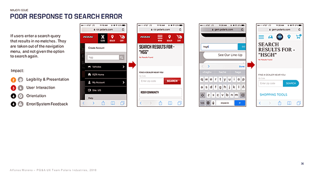
At the beginning of my tenure with the Polaris ecommerce team, mobile was seldom considered and our data showed we were falling short on findability in general. With the exception of the motorcycle brands, customers attempting to shop for products on touchscreen devices found it almost impossible not to get lost among the three different navigation systems that several platform migrations had knotted together, and which fought one another for attention. It was very hard to connect the dots, find out where you were, not be confused by the sudden change in navigation menus which often even switched users to another brand site with no warning, or access the search feature.
Approach
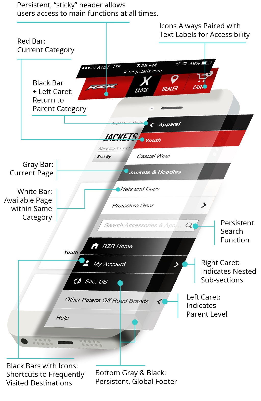
Following a heuristics evaluation, I built a prototype to test our assumptions on a more effective mobile navigation system. Areas were grouped more logically, intuitive cues were provided to help users understand where they were located and how to return to whence they came from, and progressive nesting of sections replaced the lengthy scrolls users were forced to sift through with the previous expand-collapse pattern. Due to considerable previous technical debt, the prototype was tested extensively prior to migrating to the new system. After seven iterations, it proved robust enough to take over.
Results
Less than half a year following the implementation of the new system, mobile conversion increased to 19%, abandonment rate went down 22% and build page visits went up 36% YOY. Hotjar recordings of actual user interactions revealed a drastic reduction in the amount of aimless tapping and startled pauses previously afflicting site visitors. The new taxonomy-agnostic system affords today painless modification of the information architecture with minimal impact to the platform.
WHAT
Taxonomy-agnostic mobile navigation.
(I was sole UX + Visual resource)
WHO
Polaris Industries
WHEN
2017
beyond the menus
This was all part of a larger initiative, which I championed both internally (ecommerce product team) as well as to other groups within the company, to bring the Polaris digital properties up to speed in terms of mobile usability. A full audit of these helped pave the way to effecting the cultural shift from desktop-centered to mobile-first and an improved approach to touchscreen findability proved a logical first step.