 lfonso moreno
Polaris Checkout Redesign
Challenge
The checkout funnel at Polaris needed a lot of help, particularly on mobile. Not only was the user journey not adequately optimized for touch-screen devices. Beyond this, form validation was a mess, shipping costs were not communicated well and there was great confusion between the US and the Canadian sites, which could only fulfill orders within their respective frontiers, but which attracted users of all nationalities who were misled into drilling down the wrong funnels due to lack of effective system feedback.
Approach
First I had the business partners gather existing internal data to evaluate user pain points and reveal where we were falling short. An in-depth site audit and a quick online competitive analysis helped complete the picture and outline some initial working hypotheses. These were then materialized in a couple of prototypes, which we tested and iterated upon. In a single sprint our assumptions were validated for mvp and the redesigned experience was broken up into technical user stories for a gradual implementation without disrupting day-to-day ecommerce.
Results
Within three months of implementing the first MVP changes, We observed a reduction of checkout abandonment on mobile of -22% and mobile conversion increased +19%. Overall conversion rate was +92% and revenue +76% over the previous year. This brand-agnostic, simplified design was also very easy to apply to the different Polaris sites, which helped accelerate cross-platform implementation.
WHAT
Checkout funnel redesign.
(I was sole UX resource, supported by 1 visual designer)
WHO
Polaris Industries
WHEN
2017-2018
behind the scenes
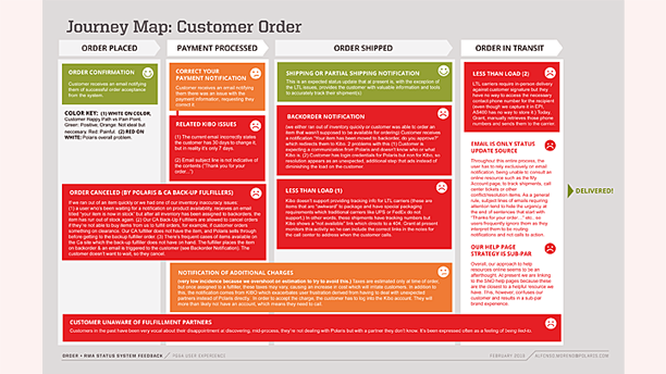
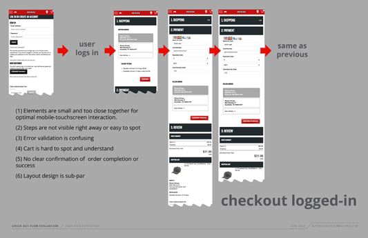
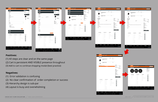
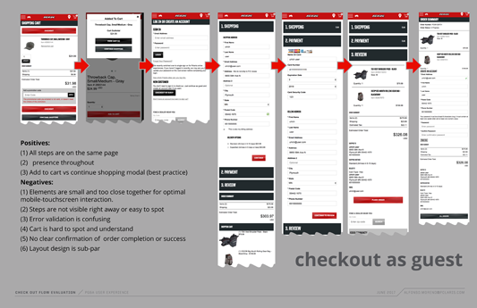
There was a lot more to this initiative which was broken into several sprints—from MVP to complete redesign—spread out through a few months. The thumbnails below capture some of the work performed analyzing the previous order management experience and the checkout funnel as it existed then. This, along with extensive work to improve system feedback, came together to create a much improved final product.
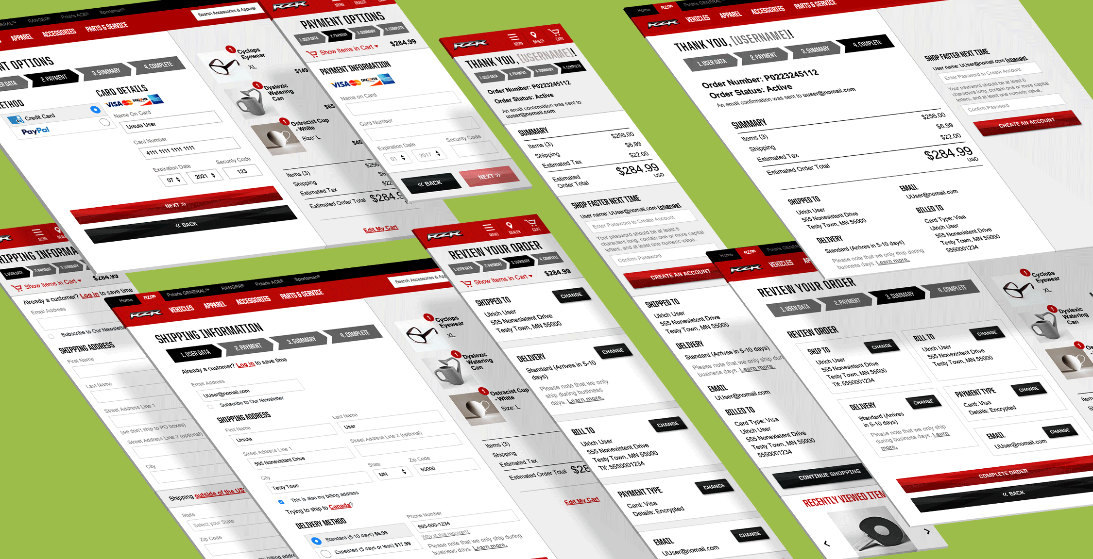
Try the working prototypes: